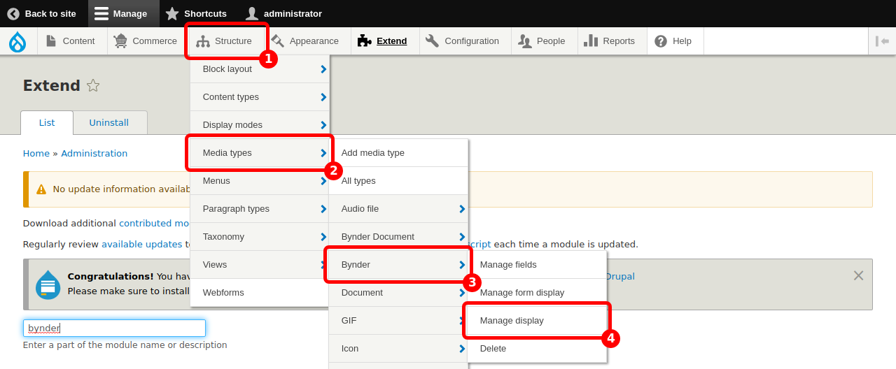
Bynder defines so-called "images derivatives": i.e. various versions of the same image: small, big, greyed, etc. Contact Bynder Support to set up the image derivatives as you need them for your site.
The version of the image (or derivative) that is displayed on a page of your website depends on its context: an image in a teaser will use a different derivative than the same image as a hero.
Here we explain how to set up an image derivative depending on the context.
Prerequisites:
- Being familiar with the concepts of 'Content display' and 'Media display'. See here for the official Drupal documentation.
Note: it would be possible to do these settings in the 'Content display' settings, directly on the Node entity (for example). We do not encourage this, and encourage you to do these settings on the 'Media display' level, as is shown in this guide. This way, your Content can use several Media types, instead of being restricted to the one you chose.
Select the option "Bynder (Image)" in the Bynder ID dropdown menu.
Set up Dynamic Asset Transformation
Bynder supports Dynamic Asset Transformation. We explain here how you can use this feature on your Drupal website.
Note: on your Bynder application, the assets have to be set as "DAT-compatible". If you display an asset on a browser that does not support DAT, it will fallback to Webimage.
In the field "DAT query field" write the query that is to be used following the rules here, starting from right after the "?".
For example: "io=transform:fit,width:100".
Set up Reponsive images
Prerequisite: being familiar with the responsive images notions (see for example here).
With the Dynamic Asset Transformation, Bynder supports responsive images for your websites.
The responsive images are defined by two sets of information: the set of sizes, which indicates to the browser which image width would be the best for which screen size; and the set of images that the browser will have access to, along with their widths.
Note: on your Bynder application, the assets have to be set as "DAT-compatible". If you display an asset on a broser that does not support DAT, it will fallback to Webimage.
With the DAT derivative selected, fill in the two fields as follows:
Sizes for responsive images: the exact string that should be in the sizes attributes of the <img>,
The set of responsive images (srcset): this string contains the information that will be used in the srcset attribute of the image. Write similar arguments as in the DAT query field above, one for each version of the image, comma separated. This field also requires you to add the width of the image in pixels next to the source image. It should look like: io=<...> 400w, io=<...> 900w etc with 400w, 900w the width of the version of the image in pixels. We prefix each “io=” with the DAT address of the files upon display.
The DAT query field should also be filled, since it is the fallback if there is any problem with one of these fields.


